dippach
residential project featuring17 apartments with a touch of industrial history in Luxembourg

client: Lionstone
gross floor area:1.800 m2
volume: 6.500 m3
project period: 2021- ongoing construction
visualization: GARE Architectural Visualization Studio and Secchi Smith Studio
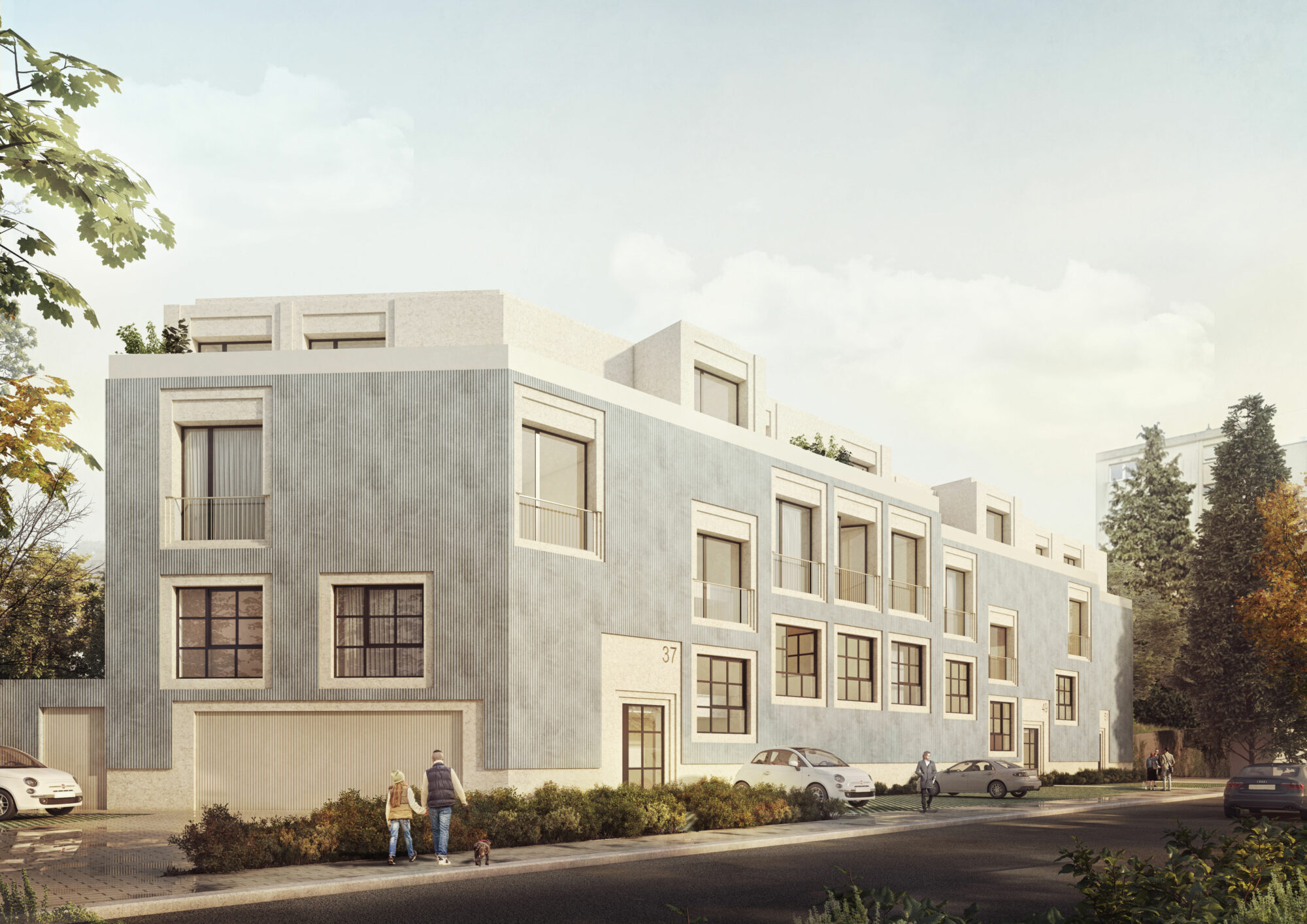
Dippach is well known for its remaining industrial buildings. It is located in the south west from Luxembourg City and connected by train since 1900. The area has changed in order to host new programs like residential areas but remains as an agricultural and productive land. The industrial architecture from the neighbours will be a key point for the concept of the exterior design from the new residential building.

The plot is located in Rue de la Gare and it is parallel to the remaining rails from the train that connects directly Dippach with the city of Luxembourg. Originally this connection was done for industrial purposes to transport raw materials and food for the people leaving there. Also, it was a way of getting imported products from other neighbouring countries that were arriving in Central Gare. Even though it looks far away from the city, the connection by train makes the long distances short in terms of time.
Trains, boats, and airplane bodies need to be strong to deal with the environment and the landscape that is around them.
In the case of industrial buildings happens the same with their facades.
But as humans since earlier times we can inhabit the coldest places, like the caves that were our first form of living space, and turn them into homes…

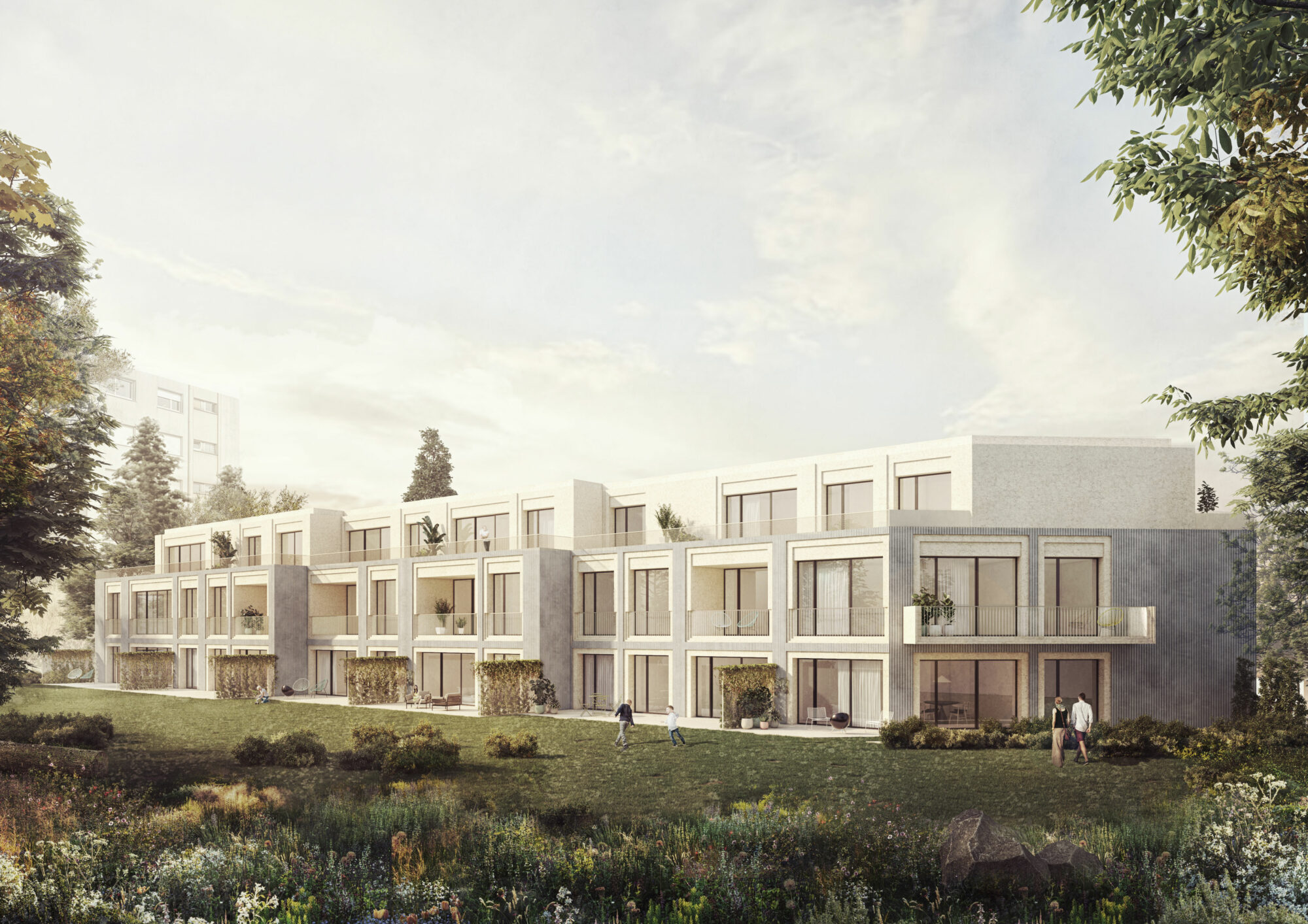
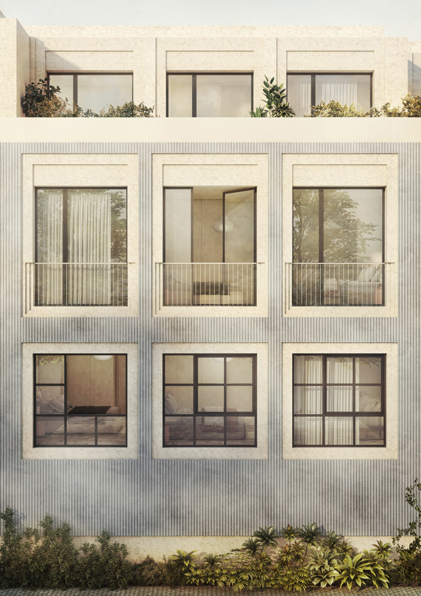
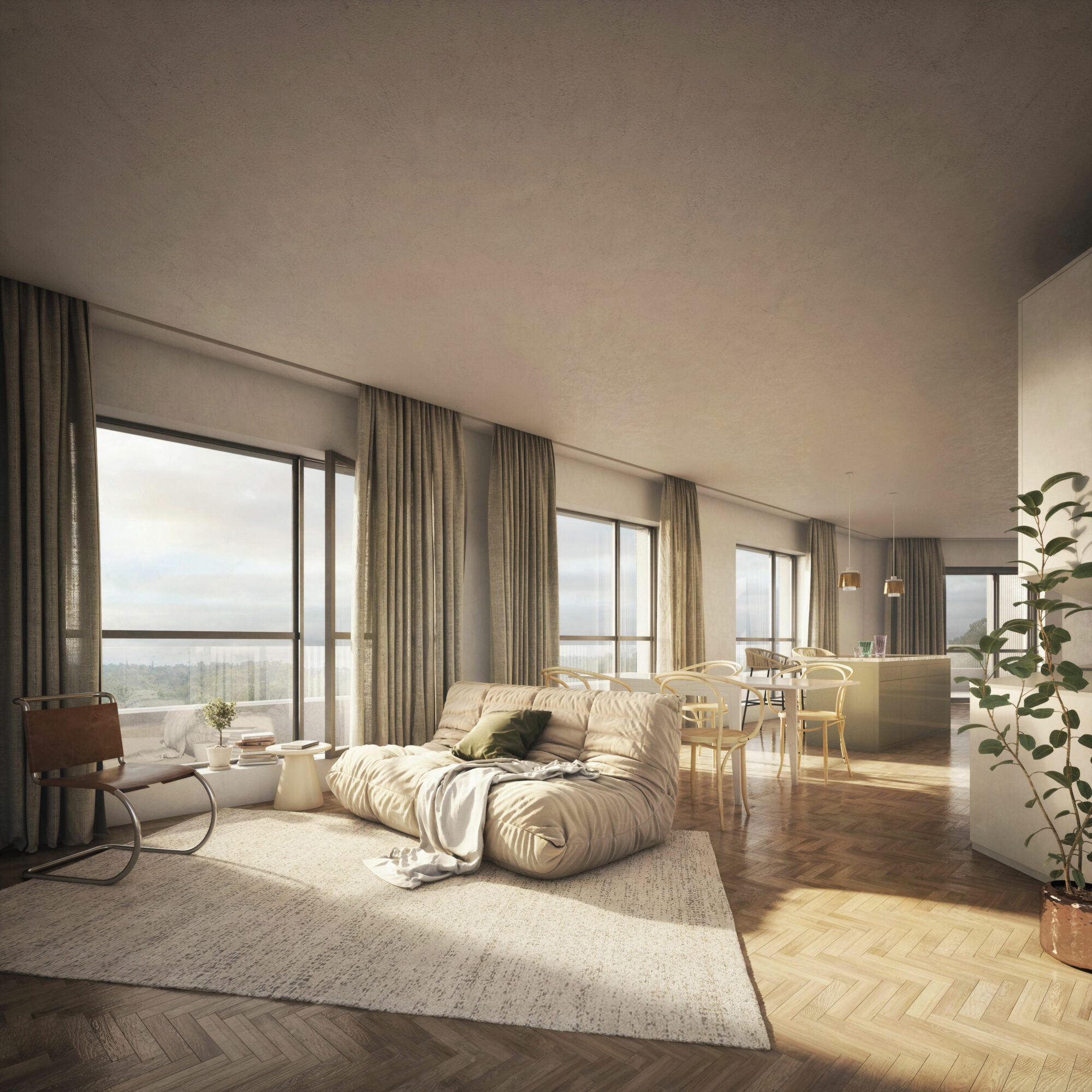
At this point, the project challenges how a building with an exterior façade that can be interpreted as industrial in terms of context can offer a warm and intimate living space in the interior.

The concept of creating a warm and welcoming interior design as an opposite of the industrial exterior space and the reflection of this dual contrast on the main design decisions is the key point of the project. The main lines of the building, which have simple and static lines in the plans and facades, have enabled us to create larger and freer spaces in the interior design and to create a feeling of spaciousness. Likewise, in the interior, in contrast to the façade and frames, the use of light and warm colours and wood further reinforces the conceptual idea.

